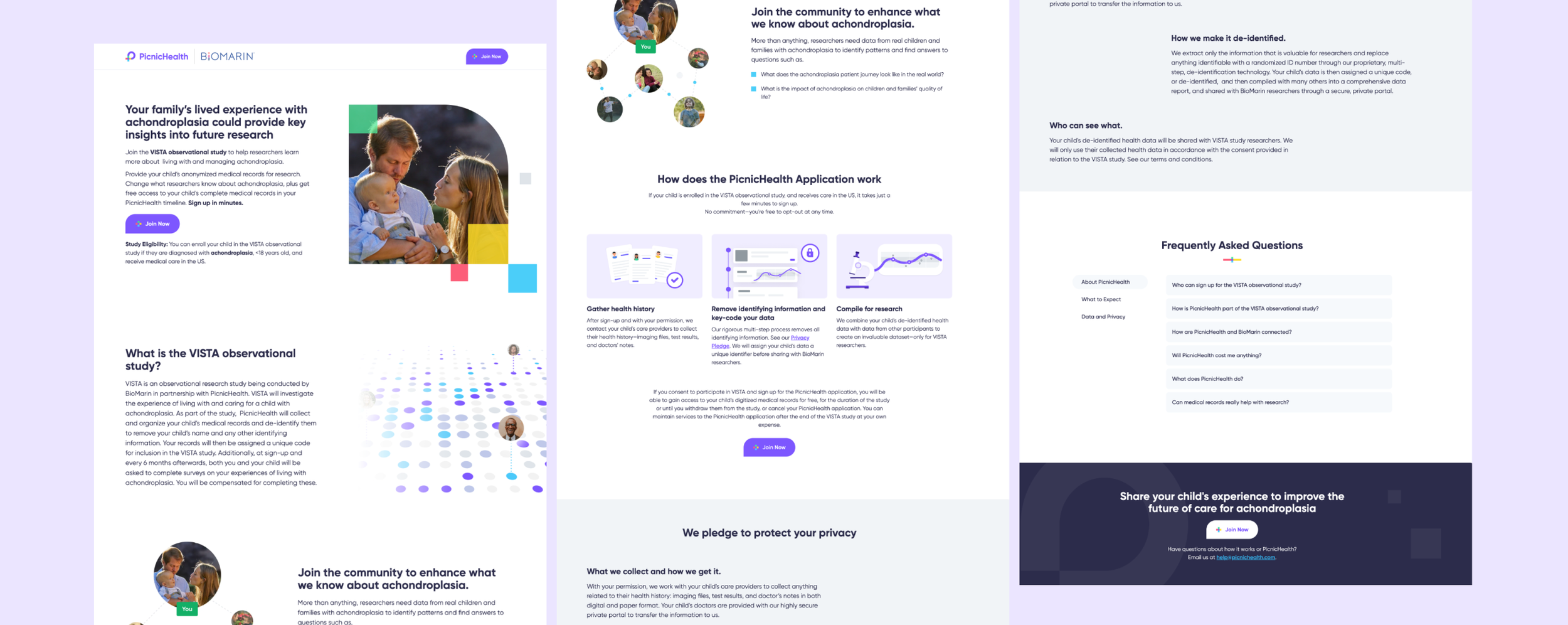
Rare Disease Recruitment Landing Page

Project Synopsis
Redesign our old achondroplasia-focused landing page based on guides and recommendations from our external partners to help improve the user experience for patients.
Joanne - Marketing Designer
Brittany D. - Community Partnerships Manager
Context & Problem
PicnicHealth has designated pages for each condition for which they recruit patients in. Some of these pages are co-branded with our partners and are used to educate and guide patients to the sign-up process for these studies.
The current landing page that we were using for one of our condition studies was in need of an update. It followed our older landing page style, and did not have the appropriate content that was needed or that patients would expect to see on the page. The majority of our sign-ups come from mobile users, so we also want to make sure that our mobile view of the landing page provides an enjoyable experience for these users.
Step 2: Ideate
Team
Step 1: Empathize + Define
The landing page is one of the most important parts of a patient’s journey to sign up. This is where patients are able to learn all about the study that they’d be participating in, including the qualifications requirements, benefits, faqs, and sign-up process. It’s extremely important to have all this information on our landing page to effectively educate the patients and caregivers who view the page. But because of all this information, it resulted in an extremely long landing page where users had to continuously scroll to get to all this information. With so much text and details, it’s likely that most patients would not read most of the page and be turned off from signing up, especially if they’re viewing this page on their mobile device. To solve this problem, we needed to condense the information and make it more digestible.
There was also a huge missing piece to the LP, which was a section that highlighted the patient community that PicnicHealth works with. This is an extremely important section to include because of PicnicHealth’s focus on patient centricity.
The clear issue that we needed to address was the amount of information that was on the page and the amount of scroll. We needed to make sure that all of the information that we needed was on the page, but we also had to make sure to include the information that our partner requested, since it was a partner-branded page. So while our marketing team drafted up copy, I created an initial layout of my idea for the page.

Step 3: Prototype + Implement
After receiving the copy from the marketing team, I began to work on the mockup. With the need for consistency, I did my best to pull parts from templates that we already used for our newer landing pages, which our visual designer created. Luckily, the marketing team and I discovered that there was a tabbed section that our designer already created, so that was the obvious solution to our scroll issue. With the multiple tabs, we’d be able to keep all the information in one area, reduce the scroll, and make the page more interactive.
From there, I just needed to build out the other sections that our partner requested, which were a section where our patient advocates could be spotlighted, and a section for blog posts that these patients have written. To do this, I researched different layouts that we could use. Based on my findings, I created several different mockups for each section in Figma and connected with the marketing team to determine which versions would work best. From there, I built out the rest of the mockup. After getting approval from the marketing team, they sent it over to our partner for approval on their side.
Once we got the green light from our partner, I worked with our product designer to get my mockup published to our website.

As of February 2024, this page is currently live, but still a work in progress. We have received positive feedback from our partner around design and content, but like many design projects, we’re always looking for ways to improve.
Below are the results after refreshing this landing page and other patient recruitment materials that I also worked on creating, which includes email newsletters, blogs, and Change Champion (patient advocacy program) biography pages.

Impact
Process
Team
What I Did
Content Strategy
Graphic Design
This was the first LP that I’ve ever created, so I needed to first build an understanding of what has worked for us before, and what hasn’t. To learn more, I worked with our marketing and community managers since they are the ones who work with advocacy organizations directly and have a good understanding of what patient needs are. I also needed to learn about what made a good landing page and what didn’t. By working with our visual designer, she was able to guide me on what is needed for an LP and what resources I could use to build this out.
Challenges